I've been a fan of Zola Jesus (a.k.a. Nika Roza Danilova) since she went on tour opening for The xx with Warpaint. I had tickets to said tour when it rolled through NYC in October 2010, but sadly, I arrived late and missed her set. However, I still sought out her music beforehand, and was instantly impressed: it's hard not to be blown away by her song
"Night" on first listen. Since then, she's released the "Valusia" EP as well as a full-length album titled
"Conatus." She writes and sings in a grandiose, operatic fashion... which isn't a coincidence: Nika is an Opera-trained singer who eventually abandoned the idea of pursuing a traditional career in Opera. This influence combined with her seemingly innate dark, moody sensibilities makes for some very powerful and memorable compositions. Despite her young age, she has already completed impressive collaborations with M83, Pictureplane, Former Ghosts, Orbital, Prefuse 73, and LA Vampires.
In short, she's a remarkably talented and unique voice, even in 2012's colorful musical landscape.
So when it came time for me plan an independent study for my final college semester, I was strongly leaning towards a music-related project. Ultimately, I decided to illustrate and design posters for my favorite bands, and Zola Jesus was one of the first that came to mind. Nika's
inherent photogenic qualities and ethereal aesthetic made her an
obvious choice. I also finished posters for Steven Wilson, Atari Teenage Riot, Big Black Delta, and Austra - all of which I'll be posting on this blog if I haven't already. Each of the posters are meant to be the kind of thing sold at a merch booth during a concert, but I still aimed for a design that could be appreciated by someone who had never heard of the band/artist before. In other words, I hoped to strike a balance between maintaining a fine art feel while still accurately promoting the band/artist to those familiar and unfamiliar with them.
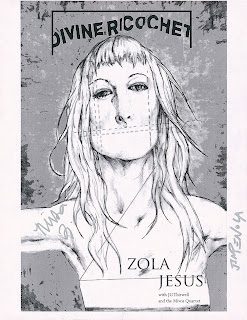
This led to me creating 2 main versions of my Zola Jesus poster: one "generic" version that isn't show or album specific, and a "Divine Ricochet" one which directly advertises her recent concert at the Guggenheim featuring JG Thirwell and the Mivos Quartet. (Divine Ricochet is the name of the concert series that Zola Jesus participated in)
Here's a rough breakdown of the poster-creating process.
Initial thumbnails and ideas:
Raw scan of final illustration:
Photoshop explorations:
Final "generic" design:
Final "Divine Ricochet" design:
Interestingly, Nika has expressed a slight frustration in her music: she writes huge-sounding songs but does so primarily through keyboards and software. Ideally, she'd be recording her tunes with massive symphonies. While she has yet to do this, she came as close as she ever has on May 10th, 2012 when she, JG Thirwell, and the Mivos Quartet
played live at the Guggenheim in NYC. I was lucky enough to get a ticket the day of the show, and couldn't be happier I did. With JG conducting the quartet through Zola's songs (which he arranged for strings specifically for the event), and Nika herself singing with great presence (despite her demure figure), the one-of-a-kind performance soared. The combination of the strings, the vocal, and occasional backing-track of electronic beats was often emotional, and always captivating. The crowd was appropriately respectful and reverent throughout - the gravitas of the music heightened by the iconic interior structure of the Guggenheim.
After the show, I walked around a bit aimlessly and eventually grabbed the setlist (which included an encore/reprise of opening number "Avalanche" in which Nika deftly went into a very high vocal register I'd never heard her do before).
After leaving the museum and mingling on the sidewalk directly outside the entrance, I handed out a few "flyers" of my poster design on black and white 8.5x11" paper. Everyone seemed to be happy to receive them, including one fan who asked for an extra. A little later on, I found that same fan again, who asked me if I drew the flyer I gave him. I told him "yes" and asked if he liked it. He also said "yes" and mentioned he'd just gotten Nika to sign it! (!!!!)
I of course freaked out and asked if she seemed to like the drawing: the fans responded affirmatively. They each got their copies signed by her, and proceeded to share the proof with me:
(EDIT 9/1/12 - Thanks to David for the hi-res scan of the signed flyer!)
Apparently, it was their 3rd time meeting Nika, and they had nothing but nice things to say about her (they were "Fan number 1" and "Fan number 1-and-a-half" respectively - awesome). They felt bad that I had missed her, but I was too taken aback by the fact that she had a.) seen my art, b.) signed it, and c.) acknowledged it in a positive way. They also asked me to sign their individual "flyers" which was of course my pleasure. At the beginning of the night, I imagined my best case scenario would be getting the high-quality, full-color print of the poster I brought to a Museum staff member (who could maybe pass it along). I was elated by the way things had actually turned out.


No comments:
Post a Comment