Sunday, October 31, 2010

NIGHT by NIGHT Clothing and Accessories

So my midterm for my Intro to Electronic Publishing class was pretty involved. First we had to create a fictional jewelery, pet, or clothing store then design a logo, letterhead, envelope, business card, and finally a package for an item at that store. Fairly quickly I decided that I wanted to go with a clothing company inspired by one of my favorite bands, Chromeo, given that they already have such a distinct fashion sense. The name was taken directly from one of their recent singles, "Night by Night." Once I settled on that, I began doing thumbnails...


...eventually leaning towards the sketch based on this black & white promo pic:


I then Photoshopped that in a way that was indicative of the original sketch I'd done.


From there, I used a sharpie marker on tracing paper to create a line drawing that was soon scanned. That drawing was adjusted in Photoshop to make it even more graphic. I also filled in the Moon shape and added text.


In retrospect, I'm not sure why I decided to omit Pee Thugg (the thickly beared gentelman on the right), but it wasn't a decision I wanted to make. At the time, I think I was going to produce the final logo in Photoshop, and Pee's presence wasn't entirely working for me in that format. Since this was a school project, and I knew my Professor wouldn't ask "Where's Pee?" or "Why did you remove Pee?" I obviously thought it was for the greater good. In any case, once I brought the Photoshop document into Illustrator it really came together. I got the thick graphic quality I was going for and could start playing around with the letterhead, business card, etc.


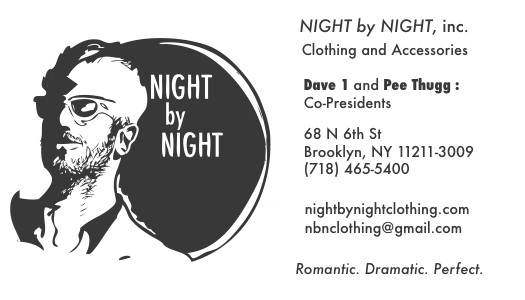
The logo was the biggest challenge at that point, so when that reached a place I was happy with, the other stuff fell into place fairly quickly, each one with subtle variations. These are the finals:


Lastly, I had to do the package design, which was by far the most intimidating aspect. I'm the first to admit that 3D is not my strength, so I wasn't looking forward to this. What was originally going to be a basic rectangular box for a pair of sunglasses turned into something more triangular (and hopefully more creative and unconventional). By the time I embraced the new shape I tried to fashion it in such a way that could make it work as a display case as well as an actual package. The bubble-wrap was "glued" down with spray mount. Eh, my Prof actually kinda liked it. Could have been much worse.


Y

So my fascination with iamamiwhoami continues. This 12" x 12" painting, completed a few weeks ago, was based on a still from the last music video "Y."

Expressive Type

My last project in my Typography class had to deal with Expressive Type, i.e. personifying the words on the page. We were allowed to choose any poem or the lyrics from any song. I was juggling a lot of different ideas (songs from The Faint, Autolux, and Chromeo were all in the running) but ultimately my Professor responded most to a song from The Black Angels called "The Sniper." This being one of favorites off their excellent new album I had no problem embracing the lyrics.

Overall, this was not an easy project (none of my Type assignments have been): between the difficulty of giving the words character while also attempting to maintain legibility and a logical sense of motion (i.e. top to bottom, left to right) there was a lot to consider. It had to be visually appealing at the end of the day, too. It's easy to go a little crazy as you finely tinker with the placement and point size of word or letter, but I think it's important to emphasize how demanding a project like this can be. There seems to be a myth than anyone can do Graphic Design, but just because the computer is most often the tool associated with the profession doesn't make it any less challenging. When all's said and done, it's simply a vessel for your ability and ideas. That's not supposed to be a boast or self -congratulatory in any way, but I often have a tougher time working with the computer than I do with the more traditional aspects of art. Bottom line: Type is hard! Keeping that in mind, I'm pretty happy with the final result, and I hope I accurately conveyed the creepy and hostile mood that's so present in the song itself.

This piece was created entirely in Adobe Illustrator. The final, physical version will see both 6 x 12 panels lined up as one 6 x 24 image. Hope you like it!


Saturday, October 30, 2010

Sketches 10-30-10

Just some character doodles done between classes, except for the colored piece with the four girls. That one was done for my Intro to Electronic Publishing class in which we had to draw a CD cover. I chose the band Warpaint who I saw open for and nearly upstage The xx. Great band, more on them in future. Until then, enjoy!


Album of the Week: Blonde Redhead - Penny Sparkle


PREFACE: Whoaaaa it's been a while! Been absolutely swamped between work and school and haven't had a chance to update this place in a while. Well, time to change that. Been meaning to do some writing and uploading of recent drawings/art projects/etc for a while now. Without further ado......


Blonde Redhead: Penny Sparke

Album of the Year? Maybe. If not that, certainly the most beautiful. One thing I can say for sure is that Blonde Redhead's latest will undoubtedly make it into my 2010 list of favorites. First and foremost, I'm no authority on the band: I know they've been around for a while and have a ton of albums I have yet to listen to, but their last 2 LPs (2007's "23" and 2004's "Misery Is A Butterfly") were outstanding. As such, I was really looking forward to "Penny Sparkle." Once I found out Van Rivers & The Subliminal Kid produced it - who also took production reigns on Fever Ray's debut - I couldn't wait. With that said, I'm happy to report that they transferred all the brilliant synth-tastic nuances of that album over to "Penny Sparkle." The combination of BR's finely honed songwriting with Van Rivers & The Subliminal Kid's detailed studio trickery is a college art student's dream.

Every song, from opener "Here Sometimes" to the goosebump-inducing "Spain" are rich with ethereal melodies, subtle guitar lines, layered percussion, and all manner of electronic magic. The anchor to every track however is singer Kazu Makino. Despite her noticeable accent, Makino's voice strikes an incredible balance between her powerful melodies and extremely delicate vocals. This is apparent on every song she sings on. The 2 tracks where she doesn't take lead, "Will There Be Stars" and "Black Guitar" (sung by guitarist Amedeo Pace) are still excellent - "Black Guitar" in particular, where the two alternate on the verse and chorus, is one of the best on the album: the melancholy mood sounds like some something Lennon or McCartney might've written on one of their darker days.

Similarly, the emotionally stunning "Love Or Prison", the album's centerpiece, leaves quite a lasting impression. The amount of space in the mix allows every sound and instrument to coalesce beautifully, the wide open feel reflective of the lonely subject matter. Listen to this one in the dark.

Yet, amongst all the amazing tunes, the closer "Spain" would have to be my favorite. The emotional intensity reaches a peak here - it's sad, triumphant, and empowering without ever missing a beat. Few bands can reach into me and settle so comfortably across different feelings, but Blonde Redhead are one of them.

The only song that doesn't stand out to me is the title track. It's not bad by any means but it lacks the memorable instrumentation of everything else on the album. As tempting as it is to review each individual song, just know that the album is perfectly balanced in its running order: it starts strong, stays strong, and ends even stronger.

This album will make your heart cry, but that makes it no less addicting.