Can't really get into Christmas/Holiday music but part of me wishes I could. To reconcile this fact, I made a playlist this year called "Weird Christmas" which is made up of not-so-traditional Christmas/Winter/Holiday songs by independent artists. It's indeed pretty weird - you wouldn't even know some of these were Christmas-themed by listening to them, like the 65daysofstatic track, but that's OK. Anyway, here it is.
1. I Do Not Care For The Winter Sun (what a great title) - Beach House
2. White Nights (Psychic TV cover) - The Golden Filter
3. The Village Drunkard - Father and Son
4. Wish List - Neon Trees
5. Christmas Reindeer - The Knife
6. TwentyFourTwelve - 65daysofstatic
7. Christmas Suite - Heidecker & Wood
8. She Came Home for Christmas - Mew
9. What's This? - Danny Elfman
10. Artificial Snow (Bedroom Take) - Atlas Sound
11. Silent Nation - AWOLNATION
I also used to have a version of "Silent Night" by IAMX/Chris Corner sung in French called "Douce Nuit" but lost it. That would've made the list otherwise.
Tuesday, December 28, 2010

Tuesday, November 2, 2010
Sketches 11-3-10
Had an absolute blast working on these today. Could have easily stayed at school another hour or two just drawing and whatnot. Been feeling very inspired lately, which I attribute to finally having a grasp on Illustrator + Photoshop as well as seeing Father and Son play this past weekend.
Sniper Girl
-An original character with no name that pops up a lot. I have fun drawing her even if she has no place or proper title (yet).


Lonely Girl
-A sketch I did this weekend that was inked with a Caligraphy pen and ink, which was really fun and a nice change of pace (I'll post the others I did using those tools soon). This is each iteration in chronological order - each one basically a test in some way. I quite like this, but I'm not sure what direction I'd want to take a final version.


Flamehead

If you didn't already notice, I like to draw on scrap paper. It's certainly better than just throwing it out. Part of the reason I like using scrap is because I sometimes put too much pressure on myself to do something brilliant when using good paper. Also, it's convenient. That said, "Flamehead" was drawn on a piece of scrap - on a test piece for my "Expressive Type" project (which I documented below). Since I thought the figure interacted in a cool way with the text behind him, I adjusted the levels in such a way that merged the 2 sides of the paper together rather keeping them separated. I think the results are kind of interesting.
I absolutely plan on doing some drawings in the near future with a heavy type/figure relationship. Something I've been wanting to do for a while.

and here's a color version...

Sniper Girl
-An original character with no name that pops up a lot. I have fun drawing her even if she has no place or proper title (yet).


Lonely Girl
-A sketch I did this weekend that was inked with a Caligraphy pen and ink, which was really fun and a nice change of pace (I'll post the others I did using those tools soon). This is each iteration in chronological order - each one basically a test in some way. I quite like this, but I'm not sure what direction I'd want to take a final version.


Flamehead

If you didn't already notice, I like to draw on scrap paper. It's certainly better than just throwing it out. Part of the reason I like using scrap is because I sometimes put too much pressure on myself to do something brilliant when using good paper. Also, it's convenient. That said, "Flamehead" was drawn on a piece of scrap - on a test piece for my "Expressive Type" project (which I documented below). Since I thought the figure interacted in a cool way with the text behind him, I adjusted the levels in such a way that merged the 2 sides of the paper together rather keeping them separated. I think the results are kind of interesting.
I absolutely plan on doing some drawings in the near future with a heavy type/figure relationship. Something I've been wanting to do for a while.

and here's a color version...

Adventures in Photoshop
In my experience, Photoshop (and virtually any kind of software) is very hard to teach. The intangible nature, to me, doesn't exactly lend itself to easy explanation. I'm sure most would agree it's best to learn when simply indulging in play - messing around; clicking on things and seeing what happens. In any case, I've always been a novice in Photoshop, only being able to do the most basic actions. However, we went over it this week in class, and maybe it's the fact that I've had a slow accumulation of knowledge regarding the program, but it started to click for the first time. Every button was explained and demoed one by one, which may not be the quickest way to do things, but logically it's the most effective. In past courses, we used Photoshop on... well... images that weren't photos. Rather, we'd create images from scratch in Photoshop. Not that there's anything wrong with. PS is obviously very versatile (something I knew at the time), but in retrospect, it makes sense why I didn't fully understand.
I'm not an expert all of a sudden or anything, but now I plan on being one. I had more fun this past Monday playing around than I ever have, most likely because I actually had some idea of how to appropriate all the functions. Definitely looking forward to playing around more. These are some of my early experiments - hope you enjoy!

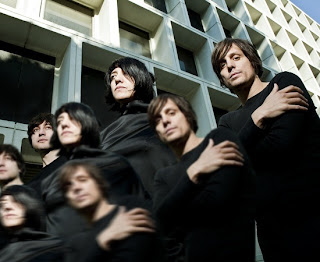
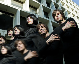

I'm not an expert all of a sudden or anything, but now I plan on being one. I had more fun this past Monday playing around than I ever have, most likely because I actually had some idea of how to appropriate all the functions. Definitely looking forward to playing around more. These are some of my early experiments - hope you enjoy!


Sunday, October 31, 2010
NIGHT by NIGHT Clothing and Accessories
So my midterm for my Intro to Electronic Publishing class was pretty involved. First we had to create a fictional jewelery, pet, or clothing store then design a logo, letterhead, envelope, business card, and finally a package for an item at that store. Fairly quickly I decided that I wanted to go with a clothing company inspired by one of my favorite bands, Chromeo, given that they already have such a distinct fashion sense. The name was taken directly from one of their recent singles, "Night by Night." Once I settled on that, I began doing thumbnails...


...eventually leaning towards the sketch based on this black & white promo pic:

I then Photoshopped that in a way that was indicative of the original sketch I'd done.

From there, I used a sharpie marker on tracing paper to create a line drawing that was soon scanned. That drawing was adjusted in Photoshop to make it even more graphic. I also filled in the Moon shape and added text.

In retrospect, I'm not sure why I decided to omit Pee Thugg (the thickly beared gentelman on the right), but it wasn't a decision I wanted to make. At the time, I think I was going to produce the final logo in Photoshop, and Pee's presence wasn't entirely working for me in that format. Since this was a school project, and I knew my Professor wouldn't ask "Where's Pee?" or "Why did you remove Pee?" I obviously thought it was for the greater good. In any case, once I brought the Photoshop document into Illustrator it really came together. I got the thick graphic quality I was going for and could start playing around with the letterhead, business card, etc.

The logo was the biggest challenge at that point, so when that reached a place I was happy with, the other stuff fell into place fairly quickly, each one with subtle variations. These are the finals:


Lastly, I had to do the package design, which was by far the most intimidating aspect. I'm the first to admit that 3D is not my strength, so I wasn't looking forward to this. What was originally going to be a basic rectangular box for a pair of sunglasses turned into something more triangular (and hopefully more creative and unconventional). By the time I embraced the new shape I tried to fashion it in such a way that could make it work as a display case as well as an actual package. The bubble-wrap was "glued" down with spray mount. Eh, my Prof actually kinda liked it. Could have been much worse.


...eventually leaning towards the sketch based on this black & white promo pic:

I then Photoshopped that in a way that was indicative of the original sketch I'd done.

From there, I used a sharpie marker on tracing paper to create a line drawing that was soon scanned. That drawing was adjusted in Photoshop to make it even more graphic. I also filled in the Moon shape and added text.

In retrospect, I'm not sure why I decided to omit Pee Thugg (the thickly beared gentelman on the right), but it wasn't a decision I wanted to make. At the time, I think I was going to produce the final logo in Photoshop, and Pee's presence wasn't entirely working for me in that format. Since this was a school project, and I knew my Professor wouldn't ask "Where's Pee?" or "Why did you remove Pee?" I obviously thought it was for the greater good. In any case, once I brought the Photoshop document into Illustrator it really came together. I got the thick graphic quality I was going for and could start playing around with the letterhead, business card, etc.

The logo was the biggest challenge at that point, so when that reached a place I was happy with, the other stuff fell into place fairly quickly, each one with subtle variations. These are the finals:


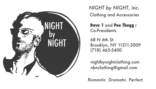
Lastly, I had to do the package design, which was by far the most intimidating aspect. I'm the first to admit that 3D is not my strength, so I wasn't looking forward to this. What was originally going to be a basic rectangular box for a pair of sunglasses turned into something more triangular (and hopefully more creative and unconventional). By the time I embraced the new shape I tried to fashion it in such a way that could make it work as a display case as well as an actual package. The bubble-wrap was "glued" down with spray mount. Eh, my Prof actually kinda liked it. Could have been much worse.


Y
So my fascination with iamamiwhoami continues. This 12" x 12" painting, completed a few weeks ago, was based on a still from the last music video "Y."


Expressive Type
My last project in my Typography class had to deal with Expressive Type, i.e. personifying the words on the page. We were allowed to choose any poem or the lyrics from any song. I was juggling a lot of different ideas (songs from The Faint, Autolux, and Chromeo were all in the running) but ultimately my Professor responded most to a song from The Black Angels called "The Sniper." This being one of favorites off their excellent new album I had no problem embracing the lyrics.
Overall, this was not an easy project (none of my Type assignments have been): between the difficulty of giving the words character while also attempting to maintain legibility and a logical sense of motion (i.e. top to bottom, left to right) there was a lot to consider. It had to be visually appealing at the end of the day, too. It's easy to go a little crazy as you finely tinker with the placement and point size of word or letter, but I think it's important to emphasize how demanding a project like this can be. There seems to be a myth than anyone can do Graphic Design, but just because the computer is most often the tool associated with the profession doesn't make it any less challenging. When all's said and done, it's simply a vessel for your ability and ideas. That's not supposed to be a boast or self -congratulatory in any way, but I often have a tougher time working with the computer than I do with the more traditional aspects of art. Bottom line: Type is hard! Keeping that in mind, I'm pretty happy with the final result, and I hope I accurately conveyed the creepy and hostile mood that's so present in the song itself.
This piece was created entirely in Adobe Illustrator. The final, physical version will see both 6 x 12 panels lined up as one 6 x 24 image. Hope you like it!


Overall, this was not an easy project (none of my Type assignments have been): between the difficulty of giving the words character while also attempting to maintain legibility and a logical sense of motion (i.e. top to bottom, left to right) there was a lot to consider. It had to be visually appealing at the end of the day, too. It's easy to go a little crazy as you finely tinker with the placement and point size of word or letter, but I think it's important to emphasize how demanding a project like this can be. There seems to be a myth than anyone can do Graphic Design, but just because the computer is most often the tool associated with the profession doesn't make it any less challenging. When all's said and done, it's simply a vessel for your ability and ideas. That's not supposed to be a boast or self -congratulatory in any way, but I often have a tougher time working with the computer than I do with the more traditional aspects of art. Bottom line: Type is hard! Keeping that in mind, I'm pretty happy with the final result, and I hope I accurately conveyed the creepy and hostile mood that's so present in the song itself.
This piece was created entirely in Adobe Illustrator. The final, physical version will see both 6 x 12 panels lined up as one 6 x 24 image. Hope you like it!


Saturday, October 30, 2010
Sketches 10-30-10
Just some character doodles done between classes, except for the colored piece with the four girls. That one was done for my Intro to Electronic Publishing class in which we had to draw a CD cover. I chose the band Warpaint who I saw open for and nearly upstage The xx. Great band, more on them in future. Until then, enjoy!


Subscribe to:
Posts (Atom)
