Thursday, March 7, 2013

Father & Son present... "Crazy 88"

My dear friends in Father & Son have just released a great new single, titled "Crazy 88." The first time I  heard this song live at the Charleston in Brooklyn, it honestly blew me away. Thankfully, the studio recording captures the magic of the live rendition. Download it for free at Bandcamp!

For the cover art they commissioned me to do, the only direction I was given was "POWER." Keeping that in mind, I absolutely wanted to convey the aggressive nature of the song in some fashion. I also took inspiration from the forthcoming music video, directed by another dear friend: the super-talented Jon Conklin - the goal being continuity between Jon's clip and my still image. While I borrowed the color palette from the video, I aimed to give my cover a voice of its own - hopefully through the torn+textured paper theme, the handwritten typography, and the portraits of the band members. Hope you like it!

Ryan Smith - skins, sax, bass, back-up voice


Tim Barr - guitar, voice


Post-it note


Final design

Tuesday, February 5, 2013

Side Effects

I decided to illustrate and design an original poster for Steven Soderbergh's latest (and apparently last) theatrical film, titled "Side Effects." The movie was written by Scott Z. Burns (Contagion) and stars Jude Law, Rooney Mara, Catherine Zeta-Jones, and Channing Tatum. I saw an advanced screening of it last night, and can't stop thinking about it. It's a creepy, well-acted, noir-ish piece of cinema. The kind that will no doubt reward repeat viewings, which is my favorite kind of film.

I received some nice mementos last night, including a few posters and some nifty ticket stubs.


Hope you like the poster!


Here's the illustration I scanned, and subsequently vivisected, for the final poster:


Finally, here are some of the thumbnails and early ideas that led to the final image:


Friday, January 18, 2013

Chairlift

If you're like me, then you were probably introduced to Chairlift (like so many were) via the famous iPod commercial featuring their song "Bruises." It's a great little spot, and famous for a reason, but if that's where your knowledge of the band's music begins and ends - I highly recommend you check out their sophomore album "Something" and be blown away.

Chairlift's debut LP "Does You Inspire You" has moments of greatness that aren't to be overlooked ("Planet Health", "Evident Utensil", "Le Flying Saucer Hat"), but their follow-up is a fantastic leap in every category.


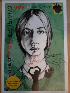
The inspiration behind the above posters comes chiefly from the music video for "I Belong in Your Arms", which itself was partly inspired by singer Caroline Polachek's time in Japan as a child. The colors are directly taken from the cover art of past Chairlift singles. The textures and smudges were somewhat of a last-minute addition, but I think it adds a layer of interest that wasn't present before. I was also hoping to evoke a comic book/manga feel with each poster, which is hopefully evident not just in the word balloons but also in the general layout.

For more insight into what I was thinking, check out these thumbnails that ultimately led to the final designs. As you can see, the idea I ended up pursuing was based on the thumbnail in the upper right with the red "C."


More thumbnails...


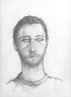
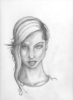
Here are the raw scans for the portraits I drew...


Caroline Polachek

Patrick Wimberly


Chairlift recently organized a Hurricane Sandy Benefit show at Glasslands Gallery in Brooklyn, in which all the proceeds went to Sandy relief. The sold-out event featured a fantastic line-up that I can no longer plead ignorance to: Chairlift guitarist Jason McMahon, Slowdance, Empress Of, and Twin Sister - all leading up to Chairlift taking the stage somewhere around 12:30am.

It was a lovely set. Singer Caroline Polachek was clearly in a state of gratitude ("We're Chairlift. This is Glasslands. And you are awesome."), as was the audience. Highlights included the drastically different live version of "Evident Utensil" and "Take it Out On Me" (the latter being my favorite song from Chairlift's last album). It was also cool to see Caroline's sister Jen joining the band as backing vocalist for "I Belong in Your Arms", and then for "Grown Up Blues" (a live debut!!), and finally "Amanaemonesia."

Despite the sometimes excruciating wait time between bands, all the acts seriously impressed (which is a rare thing), and it was all for a great cause.

Here are the framed, final prints - numbered, signed, and personalized by me for the band - a few hours before the show started.


And I met the band! My head nearly exploded when I shook Caroline's hand and she asked "Have we met before?" in complete earnest. She and Patrick were both incredibly nice, and I'm beyond thankful for the entire experience.

A very special moment...

Caroline's facial expressions are that of legend.


Another special moment...


Signing my copies...


Me and the great Patrick Wimberly.

Thank you, John Penola, for taking all of the above photos at Glasslands - it means the world. You are a great concert-partner and brother!

Finally... my personal copies of each poster, signed graciously by both Caroline and Patrick.


Friday, November 30, 2012

Marina and the Diamonds

Marina Diamandis is certainly one of my favorite pop stars. There's a refreshing uncensored quality to her lyrics that is simultaneously conceptual, funny, and melancholy without coming across as insincere. It doesn't hurt that she's a real musician either.

I originally created this poster for Marina's "YouTube Presents" appearance that my sister & I attended a few months ago in NYC. Since that wasn't a "real" concert however, it never quite felt complete - so with this imminent show at Terminal 5, I thought I would polish what I'd done and make a more definitive version. 

With my poster, my aim was to replicate/reference the subtle, "static-y" TV effect that's apparent on the cover art for "Primadonna." Furthermore, the text is meant to acknowledge the multitude of identities and archetypes Marina takes on in her current LP "Electra Heart." The bubblegum's heart shape is simply a reference to Electra Heart's first track. 

Hope you like it!

Thumbnails.


Raw scan of the original illustration.


"YouTube Presents" version.


Final Terminal 5 version.

Tuesday, November 6, 2012

Shiny Toy Guns

I've been anxiously anticipating Shiny Toy Guns' third album since they released single 'The Sun' not long after announcing the return of original STG singer Carah Faye. I've been a fan since We Are Pilots, and I've consistently been impressed by the band's songwriting and production. At long last, 'III' was released at the end of October 2012 and it does not disappoint. Some of the best material they've ever written appears on the album ('Somewhere to Hide' and "e v a y" come to mind), and I can't recommend it enough.

In addition to their new LP, Shiny Toy Guns recently wrapped up a short leg of touring the U.S. last night in NYC at Santos Party House. It was for this show (originally scheduled for Oct. 30th but delayed due to Hurricane Sandy) that I created an original poster for. It was a bit of struggle coming up with a design I liked, but no matter what I knew that I wanted portraits of the band to have some part in it.

So, once I illustrated the individual drawings below, I roughly assembled them based on some of the thumbnails I sketched. The concert's delay was somewhat of a blessing in disguise in that it gave me just enough extra time push the final design to a place that I felt was polished and good enough to present to the band.

I had the pleasure of personally giving Jeremy, Carah, Mikey, and Chad prints of the final composition last night and was very grateful for the experience. They all seemed genuinely impressed, which is of course the ultimate compliment. My thanks to the band for signing a couple copies for me, and for sharing their time with me. I hope I helped commemorate the tour for them. It was the least I could do for a band that's been so generous to my home state during this time of crisis.


RAW graphite portraits (rendered entirely w/ PALOMINO Blackwing 602 pencils)

Chad Petree

Carah Faye

Jeremy Dawson

Mikey Martin

Final poster.


Signed poster!

Friday, October 12, 2012

Free Dominguez

I can remember my 2 older brothers playing Kidneythieves when I was younger, and being very struck by it. "Taxicab Messiah" is hard to forget. One of my more distinct memories is staying up late one night watching MTV (which was the only time of day they when would play music videos when this happened) and being shocked to see the video for the title track from "Zerospace." I'm not even sure I knew a video existed for the song at the time - this being before YouTube, I immediately tried to tape as much of it as possible so I could share with my siblings the next day.

Since then, Kidneythieves have released a third album "Trypt0fanatic" and an EP "The Invisible Plan." Meanwhile, singer Free Dominguez has kept busy in between KT releases doing solo work. As of late, she's made a point to play intimate NYC shows when in the area. For her most recent NYC gig this past September, I tried illustrating the kind of poster I'd be interested in buying. Luckily, some other fans felt similarly!

Thumbnails


Final illustration
(you'll notice the right eye is under-developed since I knew I'd be covering it with an arrow anyway)


Hand-drawn arrow + text


Glitch-y effect I accidentally got when scanning the illustration - ended up being a critical part of the final poster!


Photoshop explorations.


Final poster.

(photo credit: Free Dominguez)


Keep an eye out for Free's upcoming Kickstarter campaign for her next solo LP 'Volacno+The Sea.'

Free on...


Sunday, September 30, 2012

School of Seven Bells

I've been a School of Seven Bells fan for a long time now. I can still remember my friend sharing their song Half Asleep via MySpace! I've happily followed them ever since. As per their newest (arguably best) album "Ghostory", my original poster illustration attempted to play up that theme, but was also rushed, and I kept hitting dead ends with it. However, it's still something I'm willing to revisit at some point - the pencils could definitely be tightened up for one thing.

When SVIIB announced a date at Maxwell's in Hoboken (one of my favorite venues), I knew I needed to start from scratch.

Original thumbnails


Original illustration.

Photoshop exploration.


Thumbnails take 2.


Final portrait of Benjamin.


Final portrait of Alley.


Final poster.


Maxwell's specific poster.


Physical copy, graciously signed by Benjamin (upper right) & Alley (upper left), as well as the other Alley who does live keyboards/backing vox (bottom right) and Chris who does drums (bottom left).


That's now twice in a row in which the artist in question has liked my work enough to describe it as "beautiful" (verbally and in ink), in addition to their signature (Katie Stelmanis from Austra was the first). I'm humbled and honored by their comments: I look up to these musicians.